Saturday, February 14, 2015

Sunday, October 26, 2014

Saturday, August 16, 2014

Franktown Barn - 24 x 30 Original Oil Painting by Colorado Artist Carol Hein


To purchase contact Carol at carolhein@sbcglobal.net Visit my website carolhein.com

Franktown Barn - 24 by 30 original oil painting by Colorado artist Carol Hein

This is one of my favorite barns in Franktown.  I was out last winter on a cold, snowy day trying to capture the beauty in the rolling hills near my home.  Did a quick sketch earlier this year to work out composition and color.  Just finished the final painting this morning.

Saturday, June 28, 2014

"Rush Hour" - 20 by 30 Inch Original Oil Painting by Carol Hein


"Rush Hour" 20 by 30 inch original oil painting by Carol Hein.

This was an old, old photo of New York City that I always loved because of the pattern created by the light and dark shapes.  Much of it was worked upside down so that I wouldn't be tempted to paint "things" instead of shapes.

To purchase contact Carol at carolhein@sbcglobal.net Visit my website carolhein.com

Monday, June 2, 2014

Pigeon Cove - 8 by 10 Original Oil Painting by Carol Hein


My daughter and I were in Maine a few years ago and stopped in Pigeon Cove.   It's a beautiful spot and you know me, I'm a sucker to blue.  This is off to my new gallery on Friday.

"Pigeon Cove" is an 8 by 10 original oil painting, framed and ready to hang.

To purchase contact Carol at carolhein@sbcglobal.net   Visit my website carolhein.com

Friday, May 23, 2014

5.22.14 Original Abstract Oil Painting by Colorado Artist Carol Hein


30 by 24 inch original abstract oil painting by Carol Hein.

Those who have been following my blog know that I completed 6 months of study with Kevin Weckbach in May.  The second part of the year long class started two weeks ago.  Approximately half of this class are "repeaters" from the fall.  More tried to continue but the class was full.  The "repeaters" start with bigger canvasses and oil paints.  Our first assignment was a larger abstract.  I used an assortment of brushes and pallet knives.  It's a shame that the picture doesn't show the paint quality.  We have another week of abstract work.  I get to start a new one - and then on to dark light pattern.

This abstract is for sale.  It's on 2 inch deep canvas which will be painted black.  Once the paint dries it will be varnished and ready to hang.  Right now it's drying on my dining room wall.  I really like the way it looks against the putty color in the dining room.

To purchase contact Carol at carolhein@sbcglobal.net Visit my website carolhein.com

Friday, April 18, 2014

New York Water Taxi - 8 by 10 inch Original Oil Painting by Colorado Artist Carol Hein


New York Water Taxi
8 x 10 inch original oil painting
$200 unframed

To purchase contact Carol at carolhein@sbcglobal.net Visit my website carolhein.com

Those of you following my blog know that I painted this scene in Kevin Weckbach's class using only Windsor Violet and Windsor Yellow.  Here is the same scene using my full pallet.  

Yesterday marked the half way point through his class.  I am enjoying painting again!!!!!  We're off for 3 weeks, then back at it.

Sunday, March 23, 2014

Boston Harbor Boats - 8 by 10 Inch Original Oil Painting by Colorado Artist Carol Hein


Boston Harbor Boats  - 8 by 10 inch original oil painting by Colorado artist Carol Hein.

This was painted in Kevin Weckbach's class a few weeks ago.  The visual approach is light and shadow.  It is one of the paintings of mine he critiqued and one of four selected as studies that I can paint on a 24 x 30 canvas the last three weeks of class.

Contact Carol at carolhein@sbcglobal.net.   Visit my website carolhein.com

Friday, March 21, 2014

Water Taxi - Color Theory - Original 8 X 10 Inch Oil Painting by Carol Hein


Water Taxi - 8 by 10 inch original oil painting by Colorado artist Carol Hein.

Color theory was covered in Kevin's class last month.  One of the exercises involved painting with two complementary pigments plus white.  We had to stay true to value, temperature and chroma throughout the painting. I chose the yellow-purple complement and used Windsor Yellow and Windsor Violet.  We all learned a tremendous amount about color mixing.

A second exercise was to choose one of the triads and complete a painting.  The final exercise was use color as a visual approach - the whole painting must appear to be the color you choose from a distance. So, if you pick green as a visual approach, red brick first has to appear as a version of green before reading "red brick".  Unfortunately the linen on my canvas buckled.  I started over at home but have not finished the painting.  I will finish and post it over the next couple of weeks.

Our homework over the past month has been to complete 8 small studies.  Kevin is critiquing them in class (what a learning experience that is!) and beginning in April will help us translate the study to a large painting (one side must be at least 30 inches long).

I can't believe that the first 6 months of the class is drawing to a close.  Half of the class has chosen to go on.  Many of the rest want to take the summer off and then resume in the fall.  I've chosen to go on.

Contact Carol at carolhein@sbcglobal.net Visit my website carolhein.com

Monday, February 17, 2014

Red Barn in Snow - Original Oil Painting by Colorado Artist Carol Hein


Red Barn in Snow - 8 X 10 inch original oil painting by Colorado artist Carol Hein.

This is another example of local tone as a visual approach.  Kevin has asked us to complete 8 paintings in the next 6 weeks.  He will then help us to select one of them to paint "large" on a canvas at least 30 inches long on one of the sides.

Last week we started color theory.  I will post about that later this week.

To purchase contact Carol at carolhein@sbcglobal.net Visit my website carolhein.com

Monday, February 10, 2014

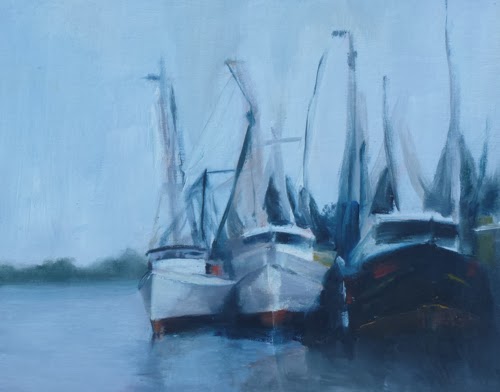
Gray Ships - 8 x 10 inch Original Oil Painting by Colorado Artist Carol Hein


Gray Ships - 8 x 10 inch original oil painting.


This painting was fun to do.  There wasn't much "color" so the shapes needed to be defined by value shifts.

It was not done in class or as a "homework" assignment so it is for sale.  $250 unframed includes shipping and handling.  To purchase contact Carol at carolhein@sbcglobal.net Visit my website carolhein.com

Tuesday, January 28, 2014

Local Tone as a Visual Approach


A couple of weeks ago an artist friend of mine gave me an earful for not posting in such a long time.  She was right!  It's been forever -  but there was Christmas, a house full of people (my daughter got engaged!), New Years, more family, you know how it goes.  Anyway, my last post was about light- dark pattern as a visual approach.  I have not included any information on equalization.  As a visual approach, equalization drove me slightly crazy.  Basically it involves bringing a uniform sense of pattern to the entire canvas.  Good examples can bee seen in Gustav Klimt's landscapes.  They are beautiful but I found drawing or painting using total equalization to be daunting.

In January we began to use color.  The painting above is an example of local tone as a visual approach.
Local tone condenses value in to 3 groups, light, medium and dark.  It is similar to what you see on an overcast day.  Everything is flattened down and there are no cast shadows.  The medium value group ties itself to either the dark group or the light group.  If the medium group is tied to the darks, the light group will stand out.  If tied to the lights, darks will stand out.  Groupings can contain several value shifts.  The group with the most value shifts draws the greatest focus.  The number of value shifts within each group should be unique.  For instance the light grouping could have 1 value, the medium 5 value shifts and the dark 2 shifts.

Artwork by Van Gogh, Andrew Wyeth, Cassatt, and the Russian School painters are all good examples of local tone.

We're moving on to Light and Shadow as a visual approach - then color theory.  Can't wait.  Paid for the next 6 months of instruction last week.

Contact me at carolhein@sbcglobal.net Visit my website carolhein.com

Monday, November 18, 2013

Light Dark Pattern as a Visual Approach - Continued


This past week we continued our study of light - dark pattern as a visual approach.  See the prior blog for an explanation see my blog post from last week.  We practiced painting something from life and then an abstract.  I threw my keys on the table as the subject for the first painting.  As usual, we are just using black and white house paint and cardboard for our ground.  We're off for 2 weeks but have homework to keep things fresh.

To purchase contact Carol at carolhein@sbcglobal.net Visit my website carolhein.com

Sunday, November 10, 2013

Dark - Light Pattern as a Visual Approach


It was good to be back in class this week.  We began to study dark-light pattern as a visual
approach and will continue to do so for 2 more sessions.  The morning lecture focused on
Motherwell's "Elegy to the Spanish Republic #34", Wyeth's "Wolf Moon" and Levine's "Birmingham 1963".

This visual approach relies on two strong value groups.  The artist must promote a pattern in one of the groups because it is the pattern that draws the eye into the painting.  The whole painting is reduced to two shapes, one dark, one light that can be seen by squinting.  Value shifts are ok as long as they belong to one of the two value groups.  The shapes still have to be unique, specific and have gradation. The artist must avoid equal weight of the dark, light shapes or the result will be a checkerboard effect.  The pattern should touch or have a visual connection.  Edges may be varied to make the paintings less static ( Motherwell vs. Levine).

Not easy!  We did two studies in the afternoon - one abstract and one from life using vine charcoal on newsprint.  My life study was the water bottle depicted above.

To purchase contact Carol at carolhein@sbcglobal.net Visit my website carolhein.com

Sunday, October 27, 2013

Shape harmony to create unity, rhythm and movement


This week we studied shape harmony to create unity, rhythm and movement throughout the piece.  Thomas Benton used shape harmony extensively to create a sense of movement in his paintings.  Using charcoal on 18 x 24 newsprint we were tasked with drawing something in the classroom to demonstrate shape harmony using only line as our approach.   I liked the repetition of “u” shapes in this jacket.  Class resumes the first week of November.  Until then I will be practicing the concept of shape harmony in sketches.


Contact Carol at carolhein@sbcglobal.net Visit my website carolhein.com

Friday, October 18, 2013

Visual Approaches to Painting - Line - Colorado Artist Carol Hein


At one time or another all of us hit a wall that is very difficult to push through alone.  I was there last summer when an artist friend recommended that I undertake a year long course of study with Kevin Weckbach.  Twelve months of study is a hugh commitment but this is turning out to be the best thing I have done for myself in a long time.  Kevin is a master painter and a generous, masterful teacher.  An overview of his class can be found by going to www.southwestart.com/featured/Kevin-Weckbach-blazing-a-trail.

Class started on October 10th.  Over the next 6 months we will explore 10 visual approaches to painting.  During the first two classes we studied line as a visual approach, immersing ourselves in the works of de Kooning, Kline and Schiele.  Using this approach requires that each line be unique - short, long, straight, curved, thick, thin, heavy, light, etc.  Lines divide space and create shapes which must also be unique.  Geometric shapes are discouraged.  No two lines or shapes may ever be repeated. Lines need to be broken so that the shapes can interlock and provide a path that leads the viewers eye through the painting.  De Kooning’s “Excavation” is a fantastic example of line as a visual approach to a painting.  But what really blew our minds was when Kevin zeroed in on a Rembrandt sketch.  He too used line as a visual approach in his sketches.  It was impossible to tell the difference between the Dutch master’s work of the 1600’s and de Kooning’s work in the mid 1900’s proving Kevin’s theory that  all masterpieces possess a visual logic no matter the “ism”.

If you ever get the chance to study with Kevin do not pass it by.

Looking at this image I can see some areas that can be improved.  Back to the easel!

I will be posting my classwork and homework as I progress through the visual approaches over the next 12 months.


Contact Carol at carolhein@sbcglobal.net Visit my website carolhein.com

Tuesday, October 1, 2013

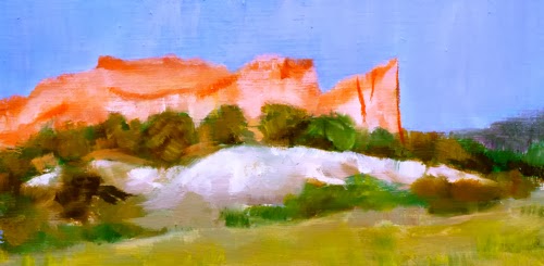
September in Garden of the Gods - Original Colorado Landscape Painting by Colorado Artist Carol Hein


September in Garden of the Gods - 4 inches by 8 inches - Original Colorado Landscape Painting by Colorado Artist Carol Hein.

I found a scrap of wood in my studio that was the perfect size for this small study.  I may do a larger version someday.

To purchase contact Carol at carolhein@sbcglobal.net Visit my website carolhein.com

Thursday, September 26, 2013

Mud Season - Original Western Landscape Painting by Colorado Artist Carol Hein


Mud Season - 9 by 12 - Original Western Landscape Oil Painting by Colorado Artist Carol Hein

This painting is available through Colorado Expressions Gallery in Colorado Springs

To view more of my work visit my website carolhein.com